The 60-second orientation: what every color, letter, line, box, and tag on an Artemis Pro chart means, and where to look first.
Artemis Pro draws everything directly on your price chart, and every element answers one question at a glance. This page is the 60-second orientation: what each color, letter, line, box, and tag means, and where to look first.
Candle Color Is The Trend
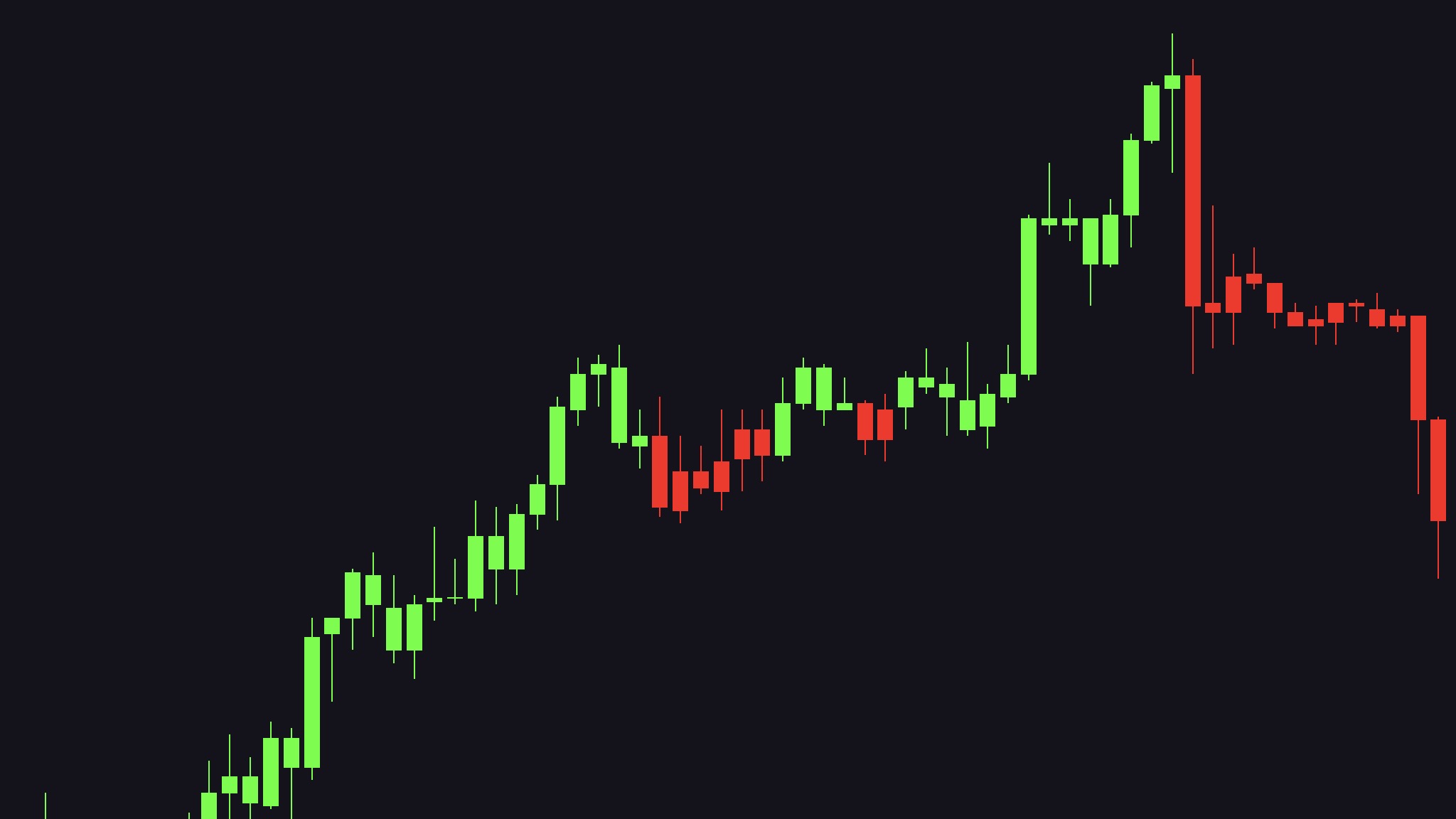
The most basic signal is the one you never have to look for. Artemis Pro colors every candle according to the current trend:
Color
Meaning
Neon green
Uptrend — the trend engine points long
Neon red
Downtrend — the trend engine points short
You never need to check a separate line or oscillator to know the trend. If the chart is green, the engine reads the market as long; if it is red, the engine reads it as short. How that color is computed — and why it can flip on a single candle — is covered in Trend Engine.
The trend at a glanceScreenshot
Black And Gray Candles Are Indecision
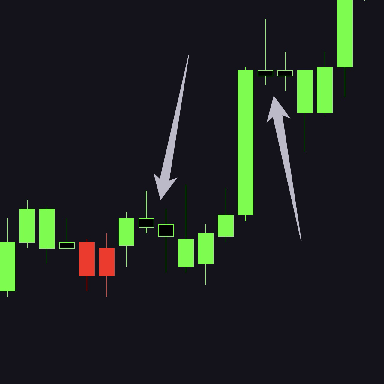
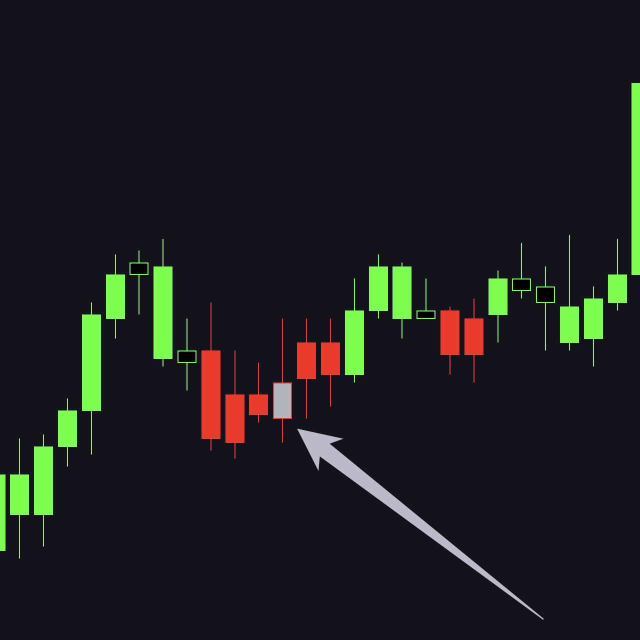
Candles whose body is less than 30 percent of their range are indecisive: mostly wick, little conviction. Artemis Pro fills their bodies with a contrasting color — black in an uptrend and light gray in a downtrend — while the wicks and borders keep the trend color.
Black fill in an uptrendScreenshot
Light-gray fill in a downtrendScreenshot
Read them like this:
One or two indecisive candles inside a trend are a pause, not a reversal. The border still tells you which side the engine is on.
Many indecisive candles in a row are chop. The market has no direction, and neither should you. Stand aside until decisive bodies return.
Chop you can see from across the room
The contrast fill exists precisely so you can see chop building at a glance. A cluster of black or gray bodies is the chart telling you to wait.
Colored Candles With Letters Are Patterns
When a candle prints in a color that is neither trend color and carries a short letter label, the pattern engine has confirmed a candlestick pattern on that bar. Every pattern evaluates on bar close and does not repaint.
Label
Pattern
Direction
MS
Morning Star
bullish
ES
Evening Star
bearish
TLS
Three-Line Strike
bullish and bearish
HK
Hikkake
bullish and bearish
3WS
Three White Soldiers
bullish
3BC
Three Black Crows
bearish
PL
Piercing Line
bullish
TOD
Three Outside Down
bearish
TOU
Three Outside Up
bullish
BnR
Bump and Run Reversal Bottom
bullish
Bullish labels print below the candle, bearish labels above it. If several patterns fire on the same bar, only the highest-ranked one prints. Full conditions, colors, and priority are in the Signal Reference.
One trend behavior is worth knowing even though it is not a labeled signal: a decisive momentum candle closing through the prior extreme flips the trend color immediately, so a full-bodied candle can turn the chart green or red on the spot without printing any special color or label of its own.
Big Label Vs. Small Label
Label size is information, not decoration:
Small label — the pattern fired on its own, away from any liquidity event. Context, not a call to action.
Large label — the pattern fired within about 3 bars of a liquidity grab or a broken swing level. This is the combination the whole method is built around.
Horizontal Lines Are Liquidity
Solid horizontal lines mark swing highs and lows — the levels where stop-loss orders cluster:
Red lines above price are resistance, drawn from swing highs.
Green lines below price are support, drawn from swing lows.
Lines appear 3 bars after the swing forms (confirmation lag, by design) and extend to the right until price touches them. At that touch — the mitigation — the line stops. Untouched lines expire after 100 bars by default. Details in Liquidity Lines.
Boxes Are Sessions
Shaded boxes mark the three major trading sessions — Asia (00:30–07:00 UTC), London (08:00–16:30 London time), and New York (09:30–16:00 New York time). For each session:
A gray opening range box wraps the first 60 minutes of the session.
Two dashed lines — session high in red and session low in green — carry the first hour's extremes across the rest of the session.
Breaks and fake-outs of these levels are classic intraday reference points. See Session Boxes.
Level Tags Are Higher-Timeframe Reference Points
Small tags on the right edge of the chart label horizontal levels imported from higher timeframes:
Tag
Level
CWH / CWL
Current week high / low
PWH / PWL
Previous week high / low
CDO
Current day open
Each line is anchored at the point in time where the level actually originated. Note that CWH/CWL track developing extremes — they update live as new highs or lows form — so treat them as context, not as fixed backtestable levels. See HTF Levels.
The Bias Label Is The Daily Lean
When the ICT Daily Bias module is enabled (settings group 5), Artemis Pro prints a compact Bias: Bullish or Bias: Bearish label on the chart — a visual-only readout of the current day's lean. Treat it as context alongside the day open, not as a signal: it does not color candles, print pattern labels, or feed the data-window series.
The Top-Right Corner Is Your Higher Timeframes
Two elements keep you aware of the bigger picture without switching charts:
Mini-candles to the right of price show up to four higher timeframes (defaults 15m, 1H, 4H), rendered through the same pattern engine with the same colors and labels. See HTF Candles.
The HTF info table shows one column per timeframe: the timeframe, a live countdown to candle close, the current direction, and any active signal. See HTF Info Table.
The Moment That Matters Most
Everything above compresses into one sequence you are watching for:
1
A liquidity line gets swept
Price sweeps a liquidity line — a red line above or a green line below — and closes back on the other side. That is a liquidity grab: stops were taken, and the breakout failed.
2
A reversal pattern confirms
Within a few bars, a reversal pattern confirms, its label prints large, and Artemis Pro registers a Setup Long or Setup Short.
A confirmed setup at a grabbed level is Artemis Pro's strongest statement. It is still not an order: the indicator marks the event, but checking the higher-timeframe context, the session, and the news calendar before deciding to trade is your job. That division of labor is deliberate — decision support, not autopilot. The full mechanics are in Liquidity Grabs.