ChartMystic
  • How it works
  • Products
  • Live demo
  • Results
  • Pricing
  • Docs
Log inSign up
  • How it works
  • Products
  • Live demo
  • Results
  • Pricing
  • Docs
  • Log in

Documentation

Artemis Pro

InstallationOverviewHow Artemis Pro ThinksReading The ChartTrend EngineSignal ReferenceLiquidity LinesLiquidity GrabsSession BoxesHTF LevelsHTF CandlesHTF Info TableBacktesting And Data WindowSupported Markets And ChartsSettings ReferenceFAQGlossary

Scribe Studio

OverviewAsk for a StrategyPerformanceTrade AnalysisCodeTweaking Your StrategyTransfer to TradingViewThe Strategy LibraryHistory & Saved StrategiesFAQGlossary
ChartMystic
Documentation/Scribe Studio/Performance

Performance

The Performance tab: the equity curve, the six headline figures, how the strategy works, and running it on another market.

The results panel has three tabs. Performance is the first, and the one that opens by default. It answers the big question, how much the strategy made and how bumpy the ride was, and it is where you run the same strategy on another market.
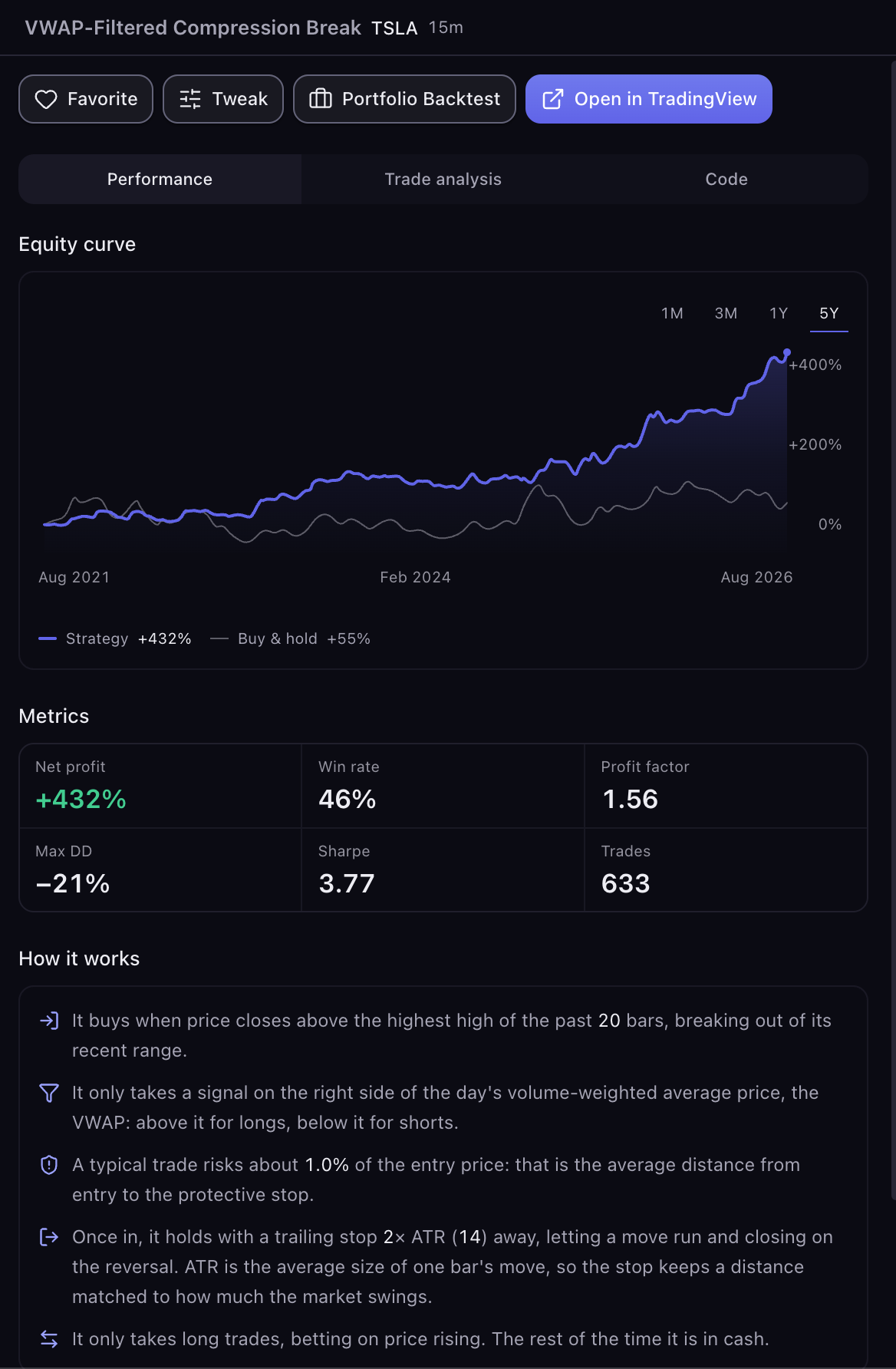
The Performance tab
Screenshot
The results panel on the Performance tab: header, actions row, equity curve with presets, the six metrics, and the How it works description

The Header

The top of the panel names the run: the strategy's name, its ticker and its timeframe.

Once a conversation has more than one result, the header becomes a dropdown called Strategy History. It lists every run from this conversation, newest first, with its name, market, timeframe, net profit with its period, and max drawdown. Pick one to show it. A small dot on the header means a newer result arrived while you were looking at an older one. When several runs share a name, they are marked v2, v3 and so on.

The Actions Row

Four buttons sit above the tabs.

  • Favorite saves the run. See History & Saved Strategies.
  • Tweak opens the editor. See Tweaking Your Strategy.
  • Portfolio Backtest runs the same rules on another market. See Running It on Another Market below.
  • Open in TradingView starts the transfer. See Transfer to TradingView.

The Equity Curve

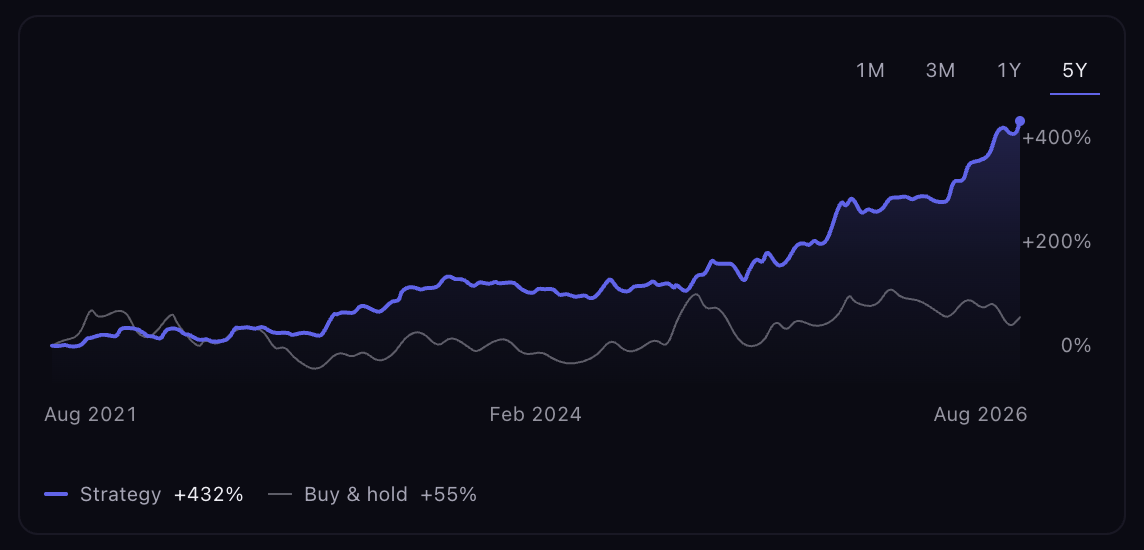
Two lines, both starting at 0%: your strategy (the colored line) and Buy & hold (the thin gray line), which is what the market itself did over the same period. Buying at the start and holding is the alternative you already had, so a strategy that made 40% while the market made 90% is not worth its complexity, and the chart makes that visible. The legend under the chart shows both end values.

Zooming. The presets 1M · 3M · 1Y · 5Y narrow the picture to the last month, three months, year or five years of the run. The panel opens on the widest preset the run's history can fill. A preset the history cannot fill is grayed out; hover it for the reason. Zooming never runs anything new.

Reading a point. Move your pointer over the chart (or tap it on a phone). The line under the chart shows the date, the strategy's return at that point, and buy & hold at that point. When you are over the end of a trade, it also names the trade, for example "#12 · +3.4%".
PreviousAsk for a StrategyNextTrade Analysis

Need help?

Percent marks run down the right edge and dates along the bottom.

A run that never traded in the window shows only the buy & hold line: the market moved whether or not the strategy did.

The equity curve
Screenshot
The equity curve with the window presets, the strategy line against Buy & hold, and the readout beneath

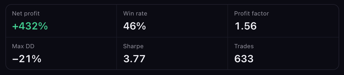
The Six Figures

Hover any label for its explanation.

FigureWhat it means
Net profitTotal return over the period shown, as a percent of the starting account. Returns compound, so this is the account's whole journey, not a per-trade average.
Win rateShare of closed trades that made money. Hover it for the count ("Here: 41 of 66 trades"). A high win rate with small wins and large losses can still lose; read it with the Trade Analysis tab.
Profit factorGross wins divided by gross losses. Above 1 means the winners outweighed the losers; above 1.5 is solid.
Max DDMax drawdown: the biggest drop from a high point along the way. The deeper it is, the more you would have had to sit through.
SharpeReturn per unit of risk. Above 1 is generally good.
TradesClosed trades, plus one still open at the end if there is one.
The metrics
Screenshot
Six metric tiles: net profit, win rate and profit factor over max drawdown, Sharpe and the trade count

Which figures follow the zoom. Net profit, Win rate, Max DD and Trades change when you press a preset; they describe the window you are looking at. Profit factor and Sharpe always describe the whole run, and their tooltips say so. While a preset is active, a note above the grid reminds you: "Max DD close-to-close · PF & Sharpe: whole run". Read all six at the widest preset when you are comparing runs, so every figure covers the same period.

Why a figure shows a dash. Scribe withholds a number rather than print one it cannot stand behind. Hover the label to see which of these applies:

  • There were no trades in this window.
  • No trade has closed yet, so there is nothing to measure. An open position does not count until it closes.
  • The ratio is too extreme to state meaningfully. A wildly lopsided profit factor is a warning, not a jackpot.

Open positions. If the strategy was still in a trade when the data ended, that trade counts in Trades and in Net profit (at the last price), but not in Win rate or Profit factor. Those count only trades that have closed. The summary in the chat says so when it applies.

How It Works

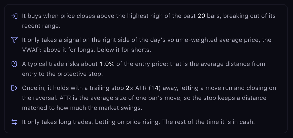
Under the figures, a short plain-English description of the strategy: what triggers an entry, what has to be true for it to take the signal, roughly how much a typical trade risks, how it exits, and which side it trades. If the strategy uses less than the whole account per trade, the position size is stated too.

"A typical trade risks about 2.1% of the entry price" is the average distance from entry to the protective stop. It is not the share of your account committed to the trade; that is the position size.

This is the strategy the script trades. Nothing is left out.

How it works
Screenshot
The How it works description beneath the metrics, walking the entry, filter, risk, exit and direction

Running It on Another Market

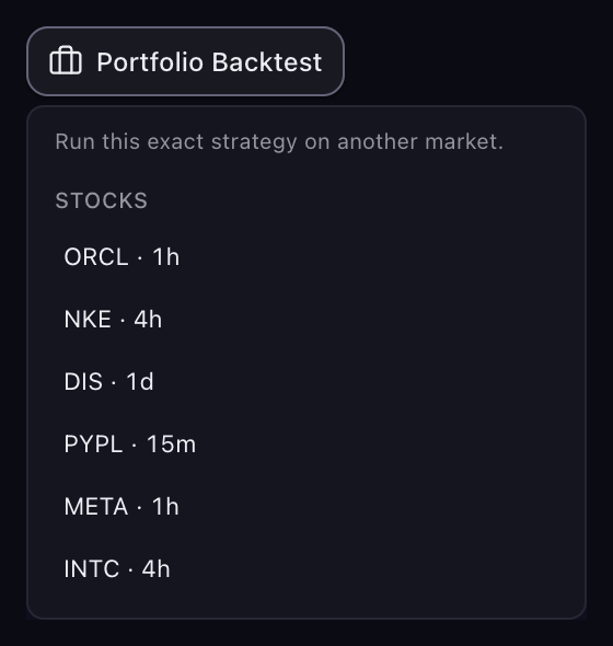
Portfolio Backtest in the actions row opens a list of other markets and timeframes you can run this exact strategy on, grouped by market type. Pick one and Scribe runs the strategy there and adds the result as a new run in the panel, with a line in the chat saying how it did: "Same rules as Trend-Confirmed Oversold Turn, run on AAPL · 1h. The panel has the numbers." If the rules did not beat buy & hold on that market, the line says so.

Where the same rules end up with a different name on the new market, Scribe says so: "On this market it goes by Golden Cross."

Each pick is one result at a time; the runs are not combined into a single portfolio figure. Use the Strategy History dropdown to flip between them. If the button reads "No other market to test this on yet", there is nowhere else to run this strategy right now.

The Portfolio Backtest list open beneath the actions row, with markets grouped by type
Visual referenceThe Portfolio Backtest picker

The list open beneath the actions row. Each row is a market and the timeframe the strategy would run on there.

Flags to Read First

Some runs carry a flag in the panel header, and it changes how to read everything below:

  • No trades. The entry conditions never fired in this window, so there is nothing to judge. Try a looser entry.
  • Small sample. Too few trades, or too short a stretch of history, for the averages to be reliable. The flag shows the counts. The strategy is not necessarily bad; the numbers just move a lot at this size. Loosening the entry usually firms the sample up.
  • Implausible profit factor. The ratio is too lopsided to state as measured. Verify in TradingView before trusting it.

A flag qualifies the numbers; it does not hide them. Read both together.

When you want to see the trades behind these figures, open Trade Analysis.